FastGridTemplate#
Open this notebook in Jupyterlite | Download this notebook from GitHub (right-click to download).
The FastGridTemplate is a simple extension of the basic template that uses the Fast design library and applies the panel.theme.Fast design system by default. Just like the ReactTemplate it is built on the react-grid-layout to provide a drag-and-drop interface for resizing and rearranging components on a grid. It is a grid-like variant where the main area acts like a grid-like container, unlike the list-like templates such as VanillaTemplate and MaterialTemplate.
Basic Templates#
For a large variety of use cases we do not need complete control over the exact layout of each individual component on the page, as could be achieved with a custom template, we just want to achieve a more polished look and feel. For these cases Panel ships with a number of default templates, which are defined by declaring four main content areas on the page, which can be populated as desired:
header: The header area of the HTML pagesidebar: A collapsible sidebarmain: The main area of the applicationmodal: A modal area which can be opened and closed from Python
These four areas behave very similarly to other Panel layout components. In particular the header, sidebar and modal behave just like the list-like Row/Column layouts while the main area behaves like a GridSpec. This means we can easily append new components into these areas. Unlike other layout components however, the contents of the areas is fixed once rendered. If you need a dynamic layout you should therefore insert a regular Panel layout component (e.g. a Column or Row) and modify it in place once added to one of the content areas.
Templates can allow for us to quickly and easily create web apps for displaying our data. Panel comes with a default Template, and includes multiple Templates that extend the default which add some customization for a better display.
Parameters:#
In addition to the four different areas we can populate, the FastGridTemplate also provides the parameters below:
site(str): Name of the site. Will be shown in the header. Default is ‘’, i.e. not shown.site_url(str): Url of the site and logo. Default is “/”.logo(str): URI of logo to add to the header (if local file, logo is base64 encoded as URI).title(str): A title to show in the header. Also added to the document head meta settings and as the browser tab title.favicon(str): URI of favicon to add to the document head (if local file, favicon is base64 encoded as URI).sidebar_footer(str): Can be used to insert additional HTML. For example a menu, some additional info, links etc.config(TemplateConfig): Contains configuration options similar topn.configbut applied to the current Template only. (Currently onlycss_filesis supported)busy_indicator(BooleanIndicator): Visual indicator of application busy state.
For configuring the grid
cols(dict): Number of columns in the grid for different display sizes (default={'lg': 12, 'md': 10, 'sm': 6, 'xs': 4, 'xxs': 2})breakpoints(dict): Sizes in pixels for various layouts (default={'lg': 1200, 'md': 996, 'sm': 768, 'xs': 480, 'xxs': 0})row_height(int, default=150): Height per row in the griddimensions(dict): Minimum/Maximum sizes of cells in grid units (default={'minW': 0, 'maxW': 'Infinity', 'minH': 0, 'maxH': 'Infinity'})prevent_collision(bool, default=False): Prevent collisions between grid items.save_layout{bool, default=False): Save layout changes to localStorage.
For styling you can use
theme(Theme): A Theme class (available inpanel.template. One ofDefaultThemeorDarkTheme).For convenience you can provide “default” or “dark” string to the constructor.
If you add
?theme=defaultor?theme=darkin the url this will set the theme unless explicitly declared
theme_toggle(boolean): IfTruea switch to toggle the Theme is shown. Default isTrue.background_color(str): Optional body background color override.neutral_color(str): Optional body neutral color override.accent_base_color(str): Optional body accent base color override. The default is #0072B5 (French Blue).header_background(str): Optional header background color override.header_color(str): Optional header text color override.header_neutral_color(str): Optional header neutral color override.header_accent_base_color(str): Optional header accent base color override.corner_radius(str): The corner radius applied to controls.font(str): A font url to import.font_url(str): A font url to import.shadow(str): Optional shadow override. Whether or not to apply shadow.main_layout(str): What to wrap the main components into. Options are ‘’ (i.e. none) and ‘card’ (Default). Could be extended to Accordion, Tab etc. in the future.
The accent argument is a short cut to set both the accent_base_color and the header_background. Some accent colors that work well are #A01346 (Fast), #00A170 (Mint), #DAA520 (Golden Rod), #2F4F4F (Dark Slate Grey), #F08080 (Light Coral) and #4099da (Summer Sky).
For layout you can use
collapsed_sidebar(str,default=False): Whether the sidebar (if present) is initially collapsed.sidebar_width(int): The width of the sidebar in pixels. Default is 330.main_max_width(str): The maximum width of the main area. For example ‘800px’ or ‘80%’. If the string is ‘’ (default) no max width is set.
For meta and base values you can use
meta_description(str): A meta description to add to the document head for search engine optimization. For example ‘P.A. Nelson’.meta_keywords(str): Meta keywords to add to the document head for search engine optimization.meta_author(str): A meta author to add to the the document head for search engine optimization. For example ‘P.A. Nelson’.meta_refresh(str): A meta refresh rate to add to the document head. For example ‘30’ will instruct the browser to refresh every 30 seconds. Default is ‘’, i.e. no automatic refresh.meta_viewport(str): A meta viewport to add to the header.base_url(str): Specifies the base URL for all relative URLs in a page. Default is ‘’, i.e. not the domain.base_target(str): Specifies the base Target for all relative URLs in a page. Default is _self.
In this case we are using the FastGridTemplate, built using the Fast.design framework. Here is an example of how you can set up a display using this template:
import hvplot.pandas
import numpy as np
import panel as pn
import pandas as pd
xs = np.linspace(0, np.pi)
freq = pn.widgets.FloatSlider(name="Frequency", start=0, end=10, value=2)
phase = pn.widgets.FloatSlider(name="Phase", start=0, end=np.pi)
def sine(freq, phase):
return pd.DataFrame(dict(y=np.sin(xs*freq+phase)), index=xs)
def cosine(freq, phase):
return pd.DataFrame(dict(y=np.cos(xs*freq+phase)), index=xs)
dfi_sine = hvplot.bind(sine, freq, phase).interactive()
dfi_cosine = hvplot.bind(cosine, freq, phase).interactive()
plot_opts = dict(
responsive=True, min_height=400,
# Align the curves' color with the template's color
color=pn.template.FastGridTemplate.accent_base_color
)
# Instantiate the template with widgets displayed in the sidebar
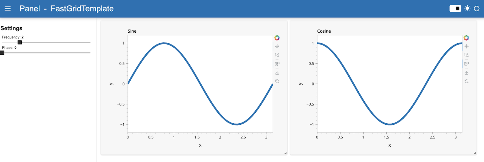
template = pn.template.FastGridTemplate(
title="FastGridTemplate",
sidebar=[freq, phase],
)
# Populate the main area with plots, to demonstrate the grid-like API
template.main[:3, :6] = dfi_sine.hvplot(title='Sine', **plot_opts).output()
template.main[:3, 6:] = dfi_cosine.hvplot(title='Cosine', **plot_opts).output()
template.servable();
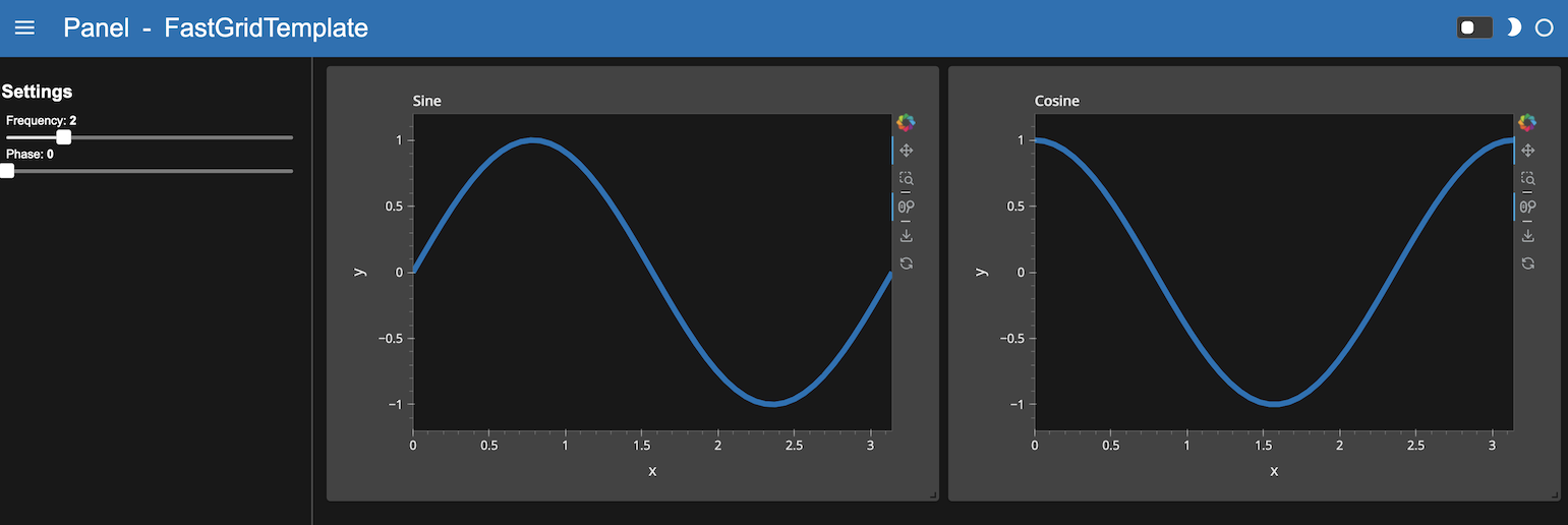
Each built-in template comes with a light (default) and dark theme. The theme can be set when instantiating the template with the theme parameter, or globally.
FastGridTemplate with DefaultTheme
FastGridTemplate with DarkTheme
Tip
Built-in templates don’t render necessarily well in a notebook as their styling can badly interact with the notebook built-in styling. You can disable rendering the output of a cell using ;, as done above. For development purposes, the app can be quickly rendered in another tab by replacing .servable() with .show(). Alternatively, the JupyterLab Preview can be used to display objects marked with .servable() in a new JupyterLab tab, circumventing any potential styling issue.
Tips & Tricks#
Make components stretch in full screen mode#
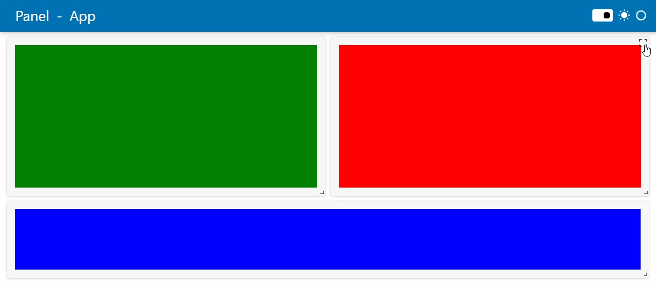
The FastGrid template is organized into cards. Each card provides a full screen button in the top, right corner. Below we will describe how to configure for full screen mode.
In order for a Panel component to maximize in full screen mode its
sizing_modeshould be set to"stretch_both"height,width,max_heightandmax_widthshould not be set.
Example
import panel as pn

pn.extension(sizing_mode="stretch_width")

layout1 = pn.Column(styles={"background": "green"}, sizing_mode="stretch_both")
layout2 = pn.Column(styles={"background": "red"}, sizing_mode="stretch_both")
layout3 = pn.Column(styles={"background": "blue"}, sizing_mode="stretch_both")

template = pn.template.FastGridTemplate(site="Panel", title="App", prevent_collision=True)
template.main[0:2,0:6]=layout1
template.main[0:2,6:12]=layout2
template.main[2:3,0:12]=layout3
template.servable()
Open this notebook in Jupyterlite | Download this notebook from GitHub (right-click to download).

