Build an App#
By now, you should have set up your environment and installed Panel, so you’re all set to dive in!
In this section, we’ll walk through creating a basic interactive application using NumPy, Pandas, and hvPlot. If you haven’t installed hvPlot yet, you can do so with pip install hvplot or conda install -c conda-forge hvplot.
Let’s envision what our app will look like:
If you’re eager to roll up your sleeves and build this app alongside us, we recommend starting with a Jupyter notebook. You can also run the code directly in the docs or launch the Notebook with JupyterLite on the right.
Important
Initially, the code block outputs on this website offer limited interactivity, indicated by the golden border to the left of the output below. By clicking the play button (), you can activate full interactivity, marked by a green left-border.
Configuring the Application#
First, let’s import the necessary dependencies and define some variables:
import hvplot.pandas
import numpy as np
import pandas as pd
import panel as pn

PRIMARY_COLOR = "#0072B5"
SECONDARY_COLOR = "#B54300"
CSV_FILE = (
    "https://raw.githubusercontent.com/holoviz/panel/main/examples/assets/occupancy.csv"
)
Next, we’ll import the Panel JavaScript dependencies using pn.extension(...). For a visually appealing and responsive user experience, we’ll set the design to "material" and the sizing_mode to stretch_width:
pn.extension(design="material", sizing_mode="stretch_width")
Fetching the Data#
Now, let’s load the UCI ML dataset that measured the environment in a meeting room. We’ll speed up our application by caching (@pn.cache) the data across users:
@pn.cache
def get_data():
  return pd.read_csv(CSV_FILE, parse_dates=["date"], index_col="date")

data = get_data()

data.tail()
Traceback (most recent call last):
  File "/Users/runner/work/panel/panel/panel/io/mime_render.py", line 165, in exec_with_return
    exec(compile(init_ast, "<ast>", "exec"), global_context)
  File "<ast>", line 5, in <module>
  File "/Users/runner/work/panel/panel/panel/io/cache.py", line 538, in wrapped_func
    func_cache, hash_value, time = hash_func(*args, **kwargs)
                                   ^^^^^^^^^^^^^^^^^^^^^^^^^^
  File "/Users/runner/work/panel/panel/panel/io/cache.py", line 490, in hash_func
    module = sys.modules[func.__module__]
             ~~~~~~~~~~~^^^^^^^^^^^^^^^^^
KeyError: None
Visualizing a Subset of the Data#
Before diving into Panel, let’s create a function that smooths one of our time series and identifies outliers. Then, we’ll plot the result using hvPlot:
def transform_data(variable, window, sigma):
    """Calculates the rolling average and identifies outliers"""
    avg = data[variable].rolling(window=window).mean()
    residual = data[variable] - avg
    std = residual.rolling(window=window).std()
    outliers = np.abs(residual) > std * sigma
    return avg, avg[outliers]


def get_plot(variable="Temperature", window=30, sigma=10):
    """Plots the rolling average and the outliers"""
    avg, highlight = transform_data(variable, window, sigma)
    return avg.hvplot(
        height=300, legend=False, color=PRIMARY_COLOR
    ) * highlight.hvplot.scatter(color=SECONDARY_COLOR, padding=0.1, legend=False)
Now, we can call our get_plot function with specific parameters to obtain a plot with a single set of parameters:
get_plot(variable='Temperature', window=20, sigma=10)
Traceback (most recent call last):
  File "/Users/runner/work/panel/panel/panel/io/mime_render.py", line 169, in exec_with_return
    out = eval(compile(_convert_expr(last_ast.body[0]), "<ast>", "eval"), global_context)
          ^^^^^^^^^^^^^^^^^^^^^^^^^^^^^^^^^^^^^^^^^^^^^^^^^^^^^^^^^^^^^^^^^^^^^^^^^^^^^^^
  File "<ast>", line 1, in <module>
  File "<ast>", line 12, in get_plot
  File "<ast>", line 3, in transform_data
NameError: name 'data' is not defined
Great! Now, let’s explore how different values for window and sigma affect the plot. Instead of reevaluating the above cell multiple times, let’s use Panel to add interactive controls and quickly visualize the impact of different parameter values.
Exploring the Parameter Space#
Let’s create some Panel slider widgets to explore the range of parameter values:
variable_widget = pn.widgets.Select(label="variable", value="Temperature", options=list(data.columns))
window_widget = pn.widgets.IntSlider(label="window", value=30, start=1, end=60)
sigma_widget = pn.widgets.IntSlider(label="sigma", value=10, start=0, end=20)
Traceback (most recent call last):
  File "/Users/runner/work/panel/panel/panel/io/mime_render.py", line 165, in exec_with_return
    exec(compile(init_ast, "<ast>", "exec"), global_context)
  File "<ast>", line 1, in <module>
NameError: name 'data' is not defined
Now, let’s link these widgets to our plotting function so that updates to the widgets rerun the function. We can achieve this easily in Panel using pn.bind:
bound_plot = pn.bind(
    get_plot, variable=variable_widget, window=window_widget, sigma=sigma_widget
)
Traceback (most recent call last):
  File "/Users/runner/work/panel/panel/panel/io/mime_render.py", line 171, in exec_with_return
    exec(compile(last_ast, "<ast>", "exec"), global_context)
  File "<ast>", line 2, in <module>
NameError: name 'variable_widget' is not defined
Once we’ve bound the widgets to the function’s arguments, we can layout the resulting bound_plot component along with the widgets using a Panel layout such as Column:
widgets = pn.Column(variable_widget, window_widget, sigma_widget, sizing_mode="fixed", width=300)
pn.Column(widgets, bound_plot)
Traceback (most recent call last):
  File "/Users/runner/work/panel/panel/panel/io/mime_render.py", line 165, in exec_with_return
    exec(compile(init_ast, "<ast>", "exec"), global_context)
  File "<ast>", line 1, in <module>
NameError: name 'variable_widget' is not defined
As long as you have a live Python process running, dragging these widgets will trigger a call to the get_plot callback function, evaluating it for whatever combination of parameter values you select and displaying the results.
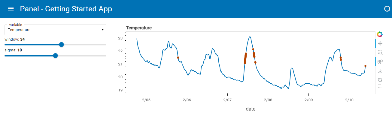
Serving the Notebook#
We’ll organize our components in a nicely styled template (MaterialTemplate) and mark it .servable() to add it to our served app:
pn.template.MaterialTemplate(
    site="Panel",
    title="Getting Started App",
    sidebar=[variable_widget, window_widget, sigma_widget],
    main=[bound_plot],
).servable(); # The ; is needed in the notebook to not display the template. Its not needed in a script
Save the notebook with the name app.ipynb.
Finally, we’ll serve the app by running the command below in a terminal:
panel serve app.ipynb --dev
Now, open the app in your browser at http://localhost:5006/app.
It should look like this:
Tip
If you prefer developing in a Python Script using an editor, you can copy the code into a file app.py and serve it.
code
import hvplot.pandas
import numpy as np
import pandas as pd
import panel as pn

PRIMARY_COLOR = "#0072B5"
SECONDARY_COLOR = "#B54300"
CSV_FILE = (
    "https://raw.githubusercontent.com/holoviz/panel/main/examples/assets/occupancy.csv"
)

pn.extension(design="material", sizing_mode="stretch_width")

@pn.cache
def get_data():
  return pd.read_csv(CSV_FILE, parse_dates=["date"], index_col="date")

data = get_data()

def transform_data(variable, window, sigma):
    """Calculates the rolling average and identifies outliers"""
    avg = data[variable].rolling(window=window).mean()
    residual = data[variable] - avg
    std = residual.rolling(window=window).std()
    outliers = np.abs(residual) > std * sigma
    return avg, avg[outliers]


def get_plot(variable="Temperature", window=30, sigma=10):
    """Plots the rolling average and the outliers"""
    avg, highlight = transform_data(variable, window, sigma)
    return avg.hvplot(
        height=300, legend=False, color=PRIMARY_COLOR
    ) * highlight.hvplot.scatter(color=SECONDARY_COLOR, padding=0.1, legend=False)

variable_widget = pn.widgets.Select(label="variable", value="Temperature", options=list(data.columns))
window_widget = pn.widgets.IntSlider(label="window", value=30, start=1, end=60)
sigma_widget = pn.widgets.IntSlider(label="sigma", value=10, start=0, end=20)

bound_plot = pn.bind(
    get_plot, variable=variable_widget, window=window_widget, sigma=sigma_widget
)

pn.template.MaterialTemplate(
    site="Panel",
    title="Getting Started App",
    sidebar=[variable_widget, window_widget, sigma_widget],
    main=[bound_plot],
).servable(); # The ; is needed in the notebook to not display the template. Its not needed in a script
panel serve app.py --dev
What’s Next?#
Now that you’ve experienced how easy it is to build a simple application in Panel, it’s time to delve into some of the core concepts behind Panel.

