React#
Open this notebook in Jupyterlite | Download this notebook from GitHub (right-click to download).
The ReactTemplate is a simple extension of the basic template that uses the react-grid-layout to provide a drag-and-drop interface for resizing and rearranging components on a grid. It is a grid-like variant where the main area acts like a grid-like container, unlike the list-like templates such as VanillaTemplate and MaterialTemplate.
Basic Templates#
For a large variety of use cases we do not need complete control over the exact layout of each individual component on the page, as could be achieved with a custom template, we just want to achieve a more polished look and feel. For these cases Panel ships with a number of default templates, which are defined by declaring four main content areas on the page, which can be populated as desired:
header: The header area of the HTML pagesidebar: A collapsible sidebarmain: The main area of the applicationmodal: A modal area which can be opened and closed from Python
These four areas behave very similarly to other Panel layout components and have list-like semantics. The ReactTemplate in particular however is an exception to this rule as the main area behaves like panel GridSpec object. Unlike regular layout components however, the contents of the areas is fixed once rendered. If you need a dynamic layout you should therefore insert a regular Panel layout component (e.g. a Column or Row) and modify it in place once added to one of the content areas.
Templates can allow for us to quickly and easily create web apps for displaying our data. Panel comes with a default Template, and includes multiple Templates that extend the default which add some customization for a better display.
Parameters:#
In addition to the four different areas we can populate the ReactTemplate declares a few variables to configure the layout:
cols(dict): Number of columns in the grid for different display sizes (default={'lg': 12, 'md': 10, 'sm': 6, 'xs': 4, 'xxs': 2})breakpoints(dict): Sizes in pixels for various layouts (default={'lg': 1200, 'md': 996, 'sm': 768, 'xs': 480, 'xxs': 0})row_height(int, default=150): Height per row in the griddimensions(dict): Minimum/Maximum sizes of cells in grid units (default={'minW': 0, 'maxW': 'Infinity', 'minH': 0, 'maxH': 'Infinity'})prevent_collision(bool, default=False): Prevent collisions between grid items.save_layout{bool, default=False): Save layout changes to localStorage.
These parameters control the responsive resizing in different layouts. The ReactTemplate also exposes the same parameters as other templates:
busy_indicator(BooleanIndicator): Visual indicator of application busy state.collapsed_sidebar(str,default=False): Whether the sidebar (if present) is initially collapsed.header_background(str): Optional header background color override.header_color(str): Optional header text color override.initial_sidebar_state(str,default='expanded'): Whether the side (if present) is expanded or collapsed initially.logo(str): URI of logo to add to the header (if local file, logo is base64 encoded as URI).site(str): Name of the site. Will be shown in the header. Default is ‘’, i.e. not shown.site_url(str): Url of the site and logo. Default is “/”.title(str): A title to show in the header.theme(Theme): A Theme class (available inpanel.template.theme)sidebar_width(int): The width of the sidebar in pixels. Default is 350.
In this case we are using the ReactTemplate, built on react-grid-layout, which provides a responsive, resizable, draggable grid layout. Here is an example of how you can set up a display using this template:
import hvplot.pandas
import numpy as np
import panel as pn
import pandas as pd
xs = np.linspace(0, np.pi)
freq = pn.widgets.FloatSlider(label="Frequency", start=0, end=10, value=2)
phase = pn.widgets.FloatSlider(label="Phase", start=0, end=np.pi)
def sine(freq, phase):
return pd.DataFrame(dict(y=np.sin(xs*freq+phase)), index=xs)
def cosine(freq, phase):
return pd.DataFrame(dict(y=np.cos(xs*freq+phase)), index=xs)
dfi_sine = hvplot.bind(sine, freq, phase).interactive()
dfi_cosine = hvplot.bind(cosine, freq, phase).interactive()
plot_opts = dict(responsive=True, min_height=400)
# Instantiate the template with widgets displayed in the sidebar
template = pn.template.ReactTemplate(
title='ReactTemplate',
sidebar=[freq, phase],
)
# Populate the main area with plots, to demonstrate the grid-like API
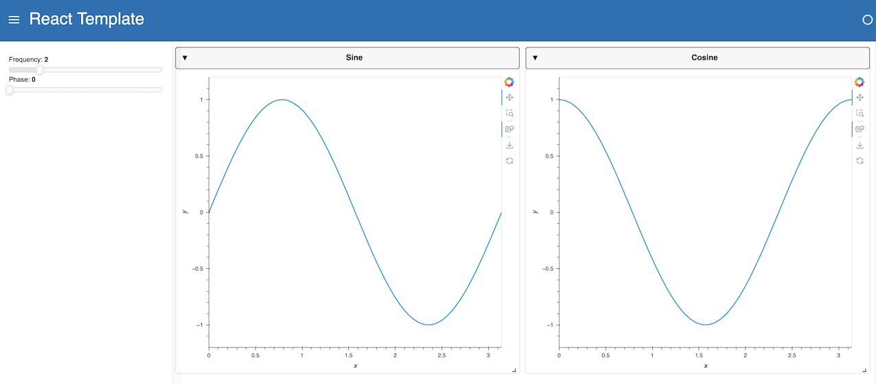
template.main[:3, :6] = pn.Card(dfi_sine.hvplot(**plot_opts).output(), title='Sine')
template.main[:3, 6:] = pn.Card(dfi_cosine.hvplot(**plot_opts).output(), title='Cosine')
template.servable();
With the row_height=150 this will result in the two Card objects filling 4 rows each totalling 600 pixels and each taking up 6 columns, which resize responsively to fill the screen and reflow when working on a smaller screen. When hovering of the top-left corner of each card a draggable handle will allow dragging the components around while a resize handle will show up at the bottom-right corner.
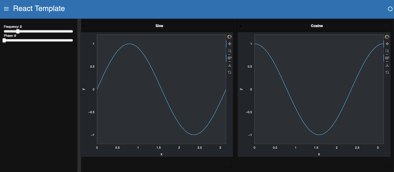
Each built-in template comes with a light (default) and dark theme. The theme can be set when instantiating the template with the theme parameter, or globally.
ReactTemplate with DefaultTheme
ReactTemplate with DarkTheme
Tip
Built-in templates don’t render necessarily well in a notebook as their styling can badly interact with the notebook built-in styling. You can disable rendering the output of a cell using ;, as done above. For development purposes, the app can be quickly rendered in another tab by replacing .servable() with .show(). Alternatively, the JupyterLab Preview can be used to display objects marked with .servable() in a new JupyterLab tab, circumventing any potential styling issue.
Open this notebook in Jupyterlite | Download this notebook from GitHub (right-click to download).

