Components Overview#
Panel is a library that provides a lot of object types and while building an app, even a simple one, you will create and interact with many of them. Compare this for instance to the Pandas library, with which you’ll normally interact with just a few object types (e.g. Series, DataFrame). It is important for you to understand the differences between the objects Panel offers and how you can use them.
import panel as pn

pn.extension(notifications=True)
The main objects that Panel provides, and that we are going to call components hereafter, short for visual components, include:
Widgets: widgets are components, usually quite small even if there are exceptions, that allow your users to interact with your app. Most importantly, they allow you to get user input! Examples include a text input, a checkbox, a slider, etc.
Panes: panes are wrappers around some data that allow you to render that data, possibly customizing the rendering. Panel is known to support many data types, especially from the PyData ecosystem. You can indeed display a Pandas DataFrame, a Plotly plot, a Matplotlib plot, an Altair plot, all together on the same app! You can of course display HTML text or just raw text. Panes aren’t limited to rendering data statically, they can allow for some user interactions and state syncing, like for instance the
AudioorVegapanes.Indicators: indicators are useful to display some static state. They are implemented as widgets that you can only control programmatically. Examples include a progress indicator or a tooltip.
Layouts: after having built various widgets, panes and indicators, it’s time to display them together. Panel provides a dozen of layout components, including of course the most common
RowandColumnlayouts.Templates: templates are components that render multiple Panel objects in an HTML document. The basic template, which you get when you serve an app without setting any template, is basically a blank canvas. When you use one of the built-in templates instead, you can easily improve the design and branding of your app, as the templates include elements like a header, a sidebar, etc.
Notifications: notifications are components that display so called “toasts”, designed to mimic the push notifications that have been popularized by mobile and desktop operating systems.
All the Panel components can be found in the Component Gallery.
Tip
Components usually have a link to their documentation page in their docstring, use <component>? in a notebook or your IDE inspection capabilities to access the link.
Parameterized components#
All components in Panel are built on the Param library. Each component declares a set of Parameters that control the behavior and output of the component. The basic idea however is that the Parameter values can be controlled both at the class-level:
pn.widgets.IntRangeSlider.width = 350
and on each instance:
pn.widgets.IntRangeSlider(width=100)
State syncing#
Be it in a notebook, in a served app, or in a Pyodide/PyScript app, Panel components sync their state between all views of the object. To better understand what that means, we create a TextInput widget and display it two times. Run the two following cells to render two views of the same widget.
w_text = pn.widgets.TextInput()
w_text
w_text
This widget has many Parameters than can be set and will be synced, i.e. a programmatic update of their value will be reflected in the user interface, affecting its views. Run the two cells below and observe the two views above being updated.
w_text.width = 100
w_text.value = 'new text'
What you just experienced is one-way syncing from your code to the user interface, i.e. from your running Python interpreter to your browser tab.
This can also work the other way around, i.e. when you modify a component from the user interface directly, its Python state gets updated accordingly. Try this out by typing some text in one of the widgets above and then execute the cell below. You will see that what you typed is now reflected in the widget value. In this case we say that the value Parameter is bi-directionally synced (or linked).
w_text.value
Core components#
Widgets#
More than 50 different widgets are available in the pn.widgets subpackage, varying from a simple text input to a more complex chat bot. The widget classes use a consistent API that allows treating broad categories of widgets as interchangeable. For instance, to select a value from a list of options, you can interchangeably use a Select widget, a RadioButtonGroup, or a range of other equivalent widgets.
value#
Widgets all have a value Parameter that holds the widget state and that is bi-directionally synced. What is accepted for value is often a constrained Parameter.
Note
One gotcha that doesn’t only apply to the value Parameter but that you are more likely to encounter with this Parameter than others is when it is referencing a mutable data structure that you mutate in-place. Take for example a MultiSelect widget whose value is a list. If you programmatically update that list directly, with for example append or extend, Panel will not be able to detect that change. In which case you need to explicitly trigger updates with w_multiselect.param.trigger('value') that will run all the same underlying machinery as if you were setting the Parameter to a new value. A notable widget that holds a multable datastructure is the Tabulator widget whose value is a Pandas DataFrame that can be updated in-place with e.g. df.loc[0, 'A'] = new_value, its patch method allows to both update the data and the user interface.
w_multi = pn.widgets.MultiSelect(options=list('abc'))
w_multi
# Setting `value` updates the user interface as expected.
w_multi.value = ['a', 'b']
# However, updating `value` in place doesn't.
w_multi.value.append('c')
# Trigger updates to also select 'c' in the user interface
w_multi.param.trigger('value')
Throttling#
There are two types of widgets that can be updated very frequently in the user interface: sliders (e.g. IntSlider, FloatSlider, RangerSlider) and text inputs (e.g. TextInput, AutocompleteInput). In some cases you may want to react on every state update of these widgets, in some others you only want to react when the user has finished interacting with the widget. For instance, you certainly do not want to run a long simulation on every step of a slider being dragged by your user, but you may want a plot to be updated live when your user moves another slider. Panel provides additional Parameters to cover those cases:
sliders: the
valueParameter is updated continuously when the slider is being dragged and thevalue_throttledParameter is updated only when the handle on the slider is released (less updates)text inputs: the
valueParameter is only updated when the Enter key is pressed or the widget loses focus and thevalue_inputParameter is updated on every key press (more updates).
pn.config.throttled = True
slider = pn.widgets.IntSlider(start=0, end=10)
text = pn.widgets.TextInput()
text.value_input
slider.param.value_throttled
label#
Most widgets can have a caption that is set with the label parameter. The name parameter is deprecated but is still accepted as an alias for label.
pn.widgets.Button(label='Click me!')
pn.widgets.TextInput(label='Age:')
description#
The description Parameter was added in Panel 1.0 to some widgets. It adds a tooltip icon next to the widget label, it supports rendering HTML content.
pn.widgets.Select(
    label='Mode', description='<ul><li>Mode 1: ...</li><li>Mode 2: ...</li></ul>',
    options=[1, 2]
)
Panes#
Pane objects makes it possible to display a wide range of plots and other media on a page, including plots (e.g. Matplotlib, Bokeh, Vega/Altair, HoloViews, Plotly, Vizzu), images (e.g. PNGs, SVGs, GIFs, JPEGs), various markup languages (e.g. Markdown, HTML, LaTeX) and DataFrames. Panes are available under the pn.pane subpackage.
pn.panel()#
Panel provides pn.panel as a convenient helper function that will convert objects into a Pane. The utility resolves the appropriate representation for an object by checking all Pane object types available and then ranking them by priority. When passing a string (for instance) there are many representations, but the PNG pane takes precedence if the string is a valid URL or local file path ending in “.png”.
png = pn.panel('https://upload.wikimedia.org/wikipedia/commons/4/47/PNG_transparency_demonstration_1.png', width=200)
png
row = pn.Row('# Title')
We can check that PNG is indeed the Pane type inferred by the utility.
print(png)
PNG(str, width=200)
object#
Panes all store the object they are wrapping on the object Parameter. Existing views of a pane will update when object is set to a new value. Let’s verify that with the Markdown pane, run the next cells to display two views of the same pane and update both of them by setting object with a new string.
p_md = pn.pane.Markdown('# Title')
p_md
p_md.object
p_md.object = '# New title'
Indicators#
Indicators are useful to show transient state (e.g. progress bar), a numerical indicator or a text indicator (e.g. tooltip). They sit in between widgets and panes, they have a value Parameter that holds their state but cannot be modified from the user interface.
i_number = pn.indicators.Number(
    label='Total Amount', value=3.5, format='{value}K',
    colors=[(5, 'green'), (10, 'red')]
)
i_number
i_number.value = 6
Indicators work well with asynchronous generators to quickly update their state without blocking.
Layouts#
Layouts, aka Panels, allow arranging other components objects into fixed-size or responsively resizing layouts, building simple apps or complex dashboards. The whole Panel library is designed to make it easy to create such objects, which is why it takes its name from them.
There are four main types of Panels:
A
Rowarranges a list of components horizontally.A
Columnarranges a list of components vertically.A
Tabsobject lays out a list of components as selectable tabs.A
GridSpeclays out components on a grid.
We aren’t going to explore all these types of layouts, instead we are going to focus on a key difference between some of them that affects how you interact with them:
The
Row,Column,Tabs,GridBox,FlexBox,AccordionandFloatPanellayouts have list-like semantics, which means they have many of the same methods as a simple Pythonlist, making it easy to add, replace, and remove components interactively usingappend,extend,clear,insert,pop,removeand__setitem__. These methods make it possible to interactively configure and modify an arrangement of plots, making them an extremely powerful tool for building apps or dashboards.The
GridSpecandGridStacklayout is quite different from the other layout types in that it isn’t list-like. Instead it behaves more like a 2D array that automatically expands when assigned to. This property makes it a very powerful means of declaring a dashboard layout with either a fixed size or with responsive sizing, i.e. one that will rescale with the browser window.
All the layout objects can be initialized as empty. When initialized with some objects, or when some new objects are set, if these objects aren’t Panel components the pn.panel helper will be called internally to convert it into a displayable representation (typically a Pane).
List-like API#
List-like layouts can be initialized with a variable number of objects. To start with, we will declare a Column and populate it with a title and a widget.
column = pn.Column('# A title', pn.widgets.FloatSlider())
column
Next we add another bit of markdown.
column.append('* Item 1\n* Item 2')
Then we add a few more widgets.
column.extend([pn.widgets.TextInput(), pn.widgets.Checkbox(label='Tick this!')])
And finally we change our mind and replace the Checkbox with a button.
column[4] = pn.widgets.Button(label='Click here')
The ability to add, remove, and replace items using list operations opens up the possibility of building rich and responsive GUIs with the ease of manipulating a Python list! You can inspect the structure of a layout calling print.
print(column)
Column
    [0] Markdown(str)
    [1] FloatSlider()
    [2] Markdown(str)
    [3] TextInput()
    [4] Button(label='Click here', name='Click here')
The Tabs and Accordion layouts behave similarly, however, when adding or replacing items, it is also possible to pass a tuple providing a custom title for the tab
tabs = pn.Tabs(('Text', 'Some text'))
tabs
# Insert a tab with a title
tabs.insert(0, ('Slider', pn.widgets.FloatSlider()))
Grid-like API#
Grid-like layouts are initialized empty and populated by setting 2D assignments to specify the index or span on indices the object in the grid should occupy. Just like a Python array, the indexing is zero-based and specifies the rows first and the columns second, i.e. gridlike[0, 1] would assign an object to the first row and second column.
To demonstrate the abilities, let us declare a grid with a wide range of different objects, including Spacers, HoloViews objects, images, and widgets.
import holoviews as hv

hv.extension('bokeh')

pn.extension('gridstack')
gspec = pn.GridStack(sizing_mode='stretch_width', height=500)
gspec[0, :3] = pn.Spacer(styles=dict(background='#FF0000'))
gspec[1:3, 0] = pn.Spacer(styles=dict(background='#0000FF'))
gspec[1:3, 1:3] = hv.Scatter([0, 1, 0]).opts(shared_axes=False)
gspec[3:5, 0] = hv.Curve([1, 2, 3])
gspec[3:5, 1] = 'https://upload.wikimedia.org/wikipedia/commons/4/47/PNG_transparency_demonstration_1.png'
gspec[4:5, 2] = pn.Column(
    pn.widgets.FloatSlider(),
    pn.widgets.ColorPicker(),
    pn.widgets.Toggle(label='Toggle Me!'))

gspec
Templates#
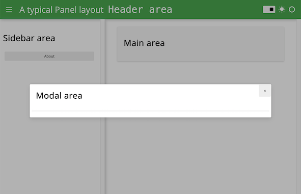
A template is the HTML document that ends up being served by your app. It defines what resources (Javascript, CSS) need to be loaded, the page title, where the Panel objects are supposed to be rendered on the page, etc.
When you serve an app without defining a particular template Panel serves it with its default template, which is pretty much a blank canvas where the served objects, if there are a few of them, will be rendered vertically one after the other.
Try saving the following snippet in a app.py file and serving it with panel serve app.py --show
import panel as pn

pn.panel('# Title').servable()
pn.panel('Some text').servable()
pn.panel('More text').servable()
When developing an app, someone (possibly you!) will be required at some point to make it prettier! A quick way to achieve that is to wrap your app in one of the templates that Panel provides, that are defined by declaring four main content areas on the page, which can be populated as desired:
header: The header area of the HTML pagesidebar: A collapsible sidebarmain: The main area of the applicationmodal: A modal, i.e. a dialog box/popup window
These four areas behave very similarly to layouts that have list-like semantics. This means we can easily append new components into these areas. Unlike other layout components however, the contents of the areas is fixed once rendered. If you need a dynamic layout you should therefore insert a regular layout (e.g. a Column or Row) and modify it in place once added to one of the content areas.
Warning
The templates provided by Panel should not be rendered in a notebook, as their CSS styling usually doesn’t play well with the CSS styling of the notebook itself.
Since an app can only have one template, Panel allows to declare the app template via pn.extension(template='..'). Of course you can also explicitly instantiate a template and manipulate it as you would do with other Panel objects. Try serving the content of this snippet.
import panel as pn


template = pn.template.BootstrapTemplate(title='Loving Panel!')


def compute(i):
    return '❤️' * i


w_number = pn.widgets.IntSlider(value=5, start=1, end=5)
p_hearts = pn.panel(pn.bind(compute, w_number))

template.sidebar.append(w_number)
template.main.append(p_hearts)
template.show()
Notifications#
The web apps you end up building with Panel are often quite interactive. Therefore you will be interested in finding a way to let your users know what’s going on, when their operations succeed or abort, etc. This is exactly what notifications are for! Contrary to the components we have just covered, notifications are objects you don’t manipulate directly, instead you just call pn.state.notifications with one the following methods: success, info, warning and error.
pn.state.notifications.success('Your first notification!')
pn.state.notifications.error('Oops!', duration=5000)

