Templates Overview#
When deploying a Panel app or dashboard as a Bokeh application, it is rendered into a default template that serves the JS and CSS resources as well as the actual Panel object being shown. However, it is often desirable to customize the layout of the deployed app, or even to embed multiple separate panels into an app. The Template component in Panel allows customizing this default template, including the ability to rendering multiple components in a single document easily.
What is a template?#
A template is defined using the Jinja2 templating language, which makes it straightforward to extend the default template in various ways or even replace it entirely. However most users can avoid modifying the jinja2 template directly by using one of the default templates shipped with Panel itself.
Using default templates#
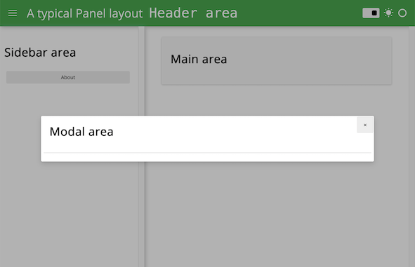
For a large variety of use cases we do not need complete control over the exact layout of each individual component on the page, instead we just want to achieve a more polished look and feel. For these cases Panel ships with a number of default templates, which are defined by declaring four main content areas on the page, which can be populated as desired:
header: The header area of the HTML pagesidebar: A collapsible sidebarmain: The main area of the applicationmodal: A modal, i.e. a dialog box/popup window
These four areas behave very similarly to other Panel layout components and have list-like semantics. This means we can easily append new components into these areas. Unlike other layout components however, the contents of the areas is fixed once rendered. If you need a dynamic layout you should therefore insert a regular Panel layout component (e.g. a Column or Row) and modify it in place once added to one of the content areas.
Supported templates#
Panel ships with a number of these default themes built on different CSS frameworks:
BootstrapTemplate: Built on Bootstrap v4VanillaTemplate: Built using pure CSS without relying on any specific frameworkFastListTemplate: Built on the Fast UI framework using a list-like APIFastGridTemplate: Built on the Fast UI framework using grid-like APIGoldenTemplate: Built on the Golden Layout frameworkSlidestemplate: For presentations, built on reveal.js framework

